01
Housing · Web · Mobile
Nest
Turning scattered home inspiration into a calm, intuitive workspace for planning, organizing, and bringing interior design projects to life.
Open case study →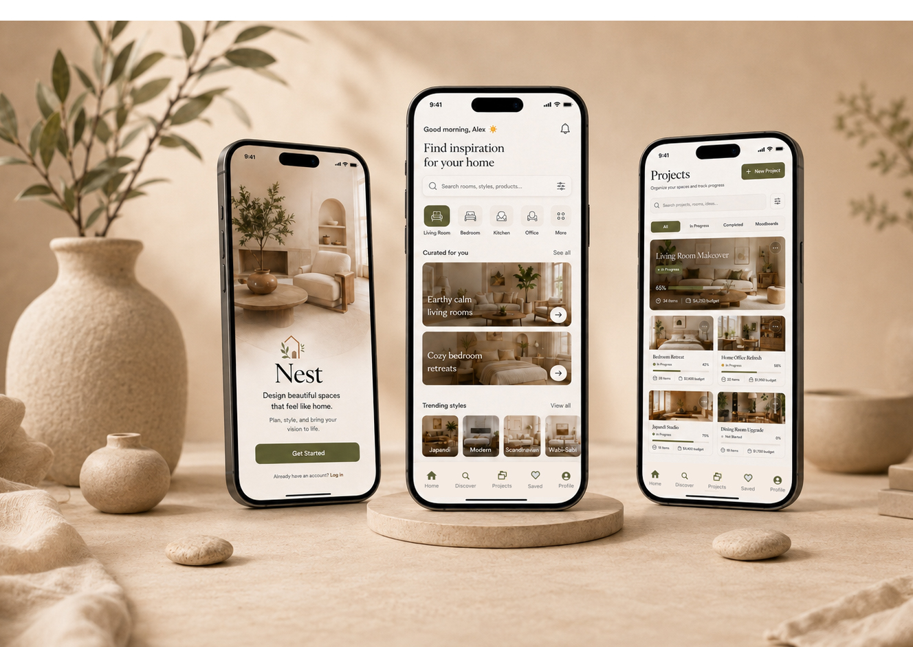
I design precise, human-centered digital products
Turning complex systems into interfaces that feel effortless, considered, and quietly premium.
Four selected engagements. Each expands into a full case study, research through final interface.
Turning scattered home inspiration into a calm, intuitive workspace for planning, organizing, and bringing interior design projects to life.
Open case study →A telehealth companion that turns anxious, fragmented care moments into a calm, guided path from symptom to specialist.
Open case study →
Simplifying everyday grocery shopping by bringing product discovery, shopping lists, and purchasing decisions into one clear, intuitive experience.
Open case study →
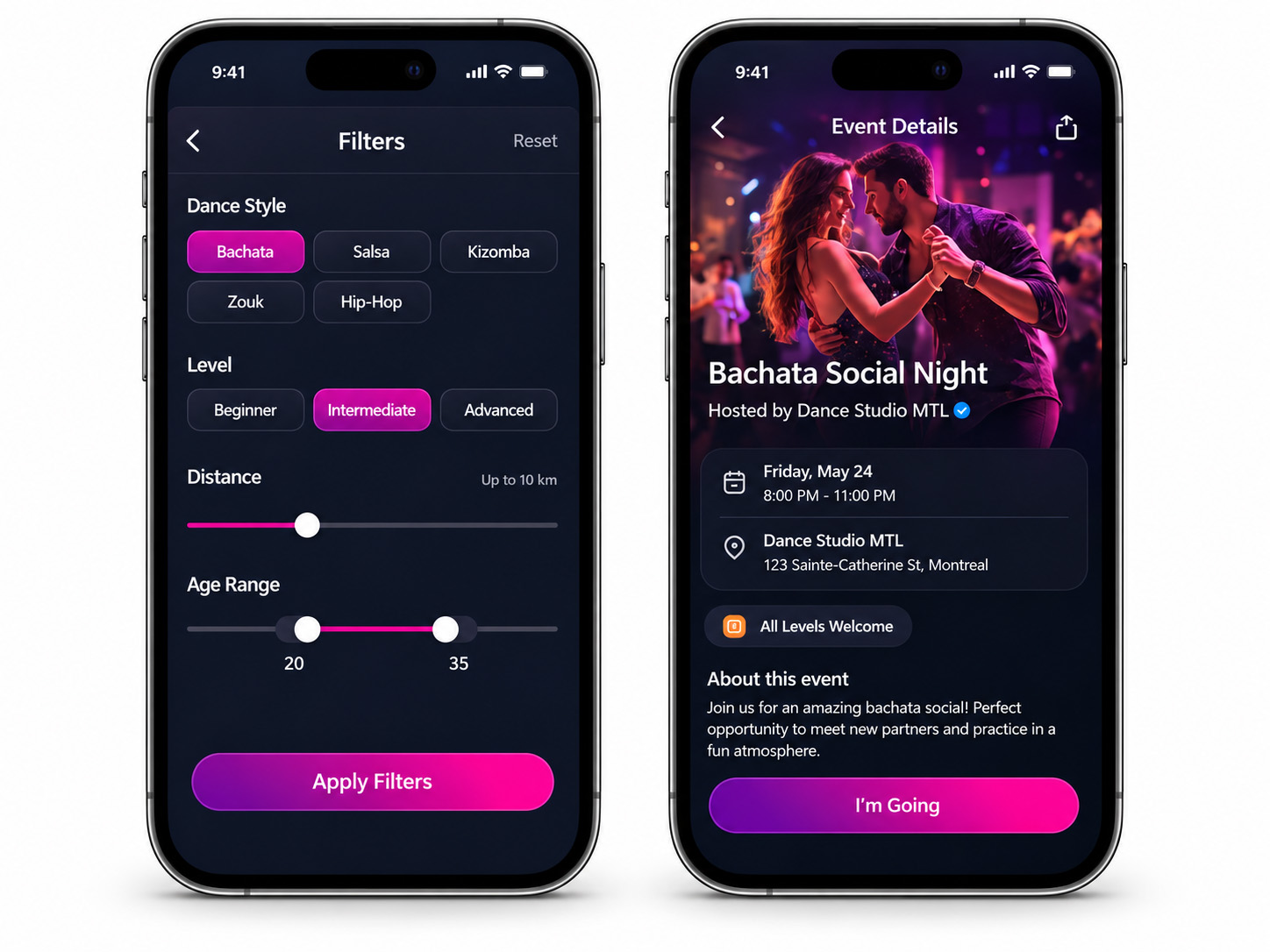
Connecting dancers through a simple, engaging experience for discovering compatible partners, matching by style and skill, and turning shared interests into real-world connections.
Open case study →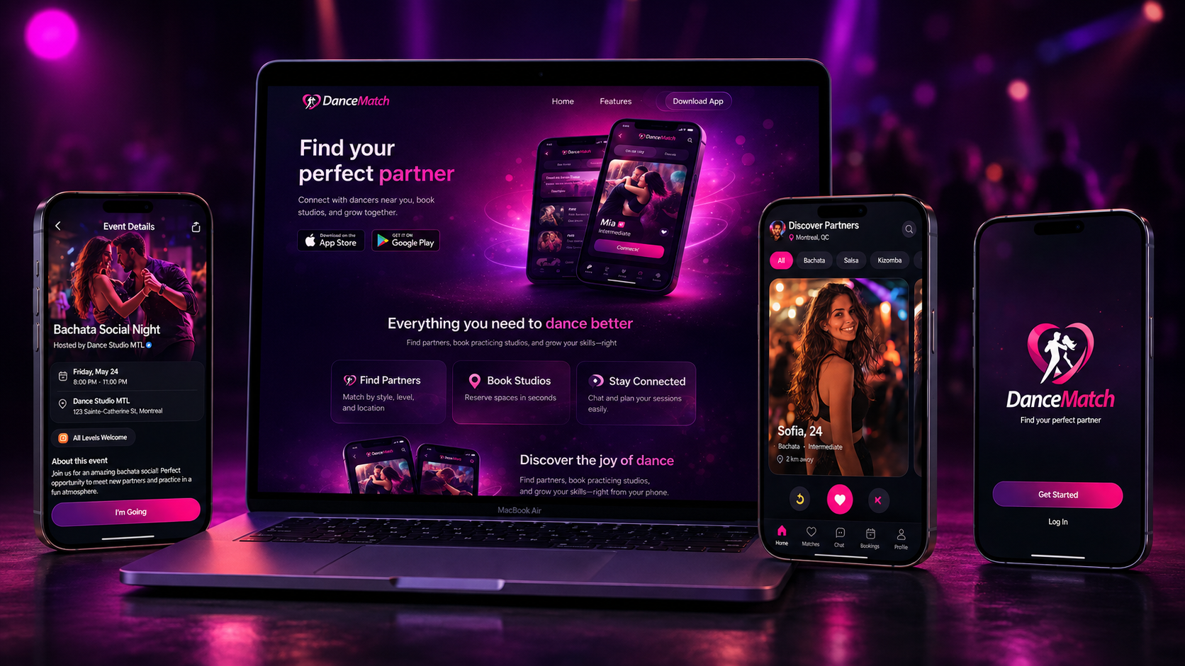
A product designer focused on creating simple, useful, and visually clear digital experiences.
I work across the full design process, from research and early ideas to user flows, prototyping, and final interfaces.
My background in visual storytelling and creative production shapes how I approach design, but I always start with the problem and the user.
I like testing ideas, refining the details, and making sure each screen works as part of a clear consistent system.
Interviews, user research, and data review to understand the problem before starting the design.
Turning research into clear personas, user journeys, and problem statements that guide the design.
From early wireframes to polished interfaces, with a focus on clarity, consistency, and what can actually be built.
Usability testing, accessibility checks, and clear feedback to improve the final design.
Components, variables, auto-layout, responsive systems, prototyping, and scalable design files.
Image editing, compositing, retouching, color work, mockups, and visual asset creation.
Vector graphics, icons, interface assets, typography, and presentation-ready artwork.
Motion design, editing, transitions, timing, and visual storytelling across digital experiences.
User flows, wireframes, usability testing, research, information architecture, and iterative design.
Typography, composition, hierarchy, grids, color, and polished visual systems across screen and print.
Interactive, high-fidelity prototypes for testing flows, interactions, responsive behavior, and product concepts.
layout, composition, and cinematic visualization.
States, transitions, feedback, motion, and micro-interactions that make digital products feel intuitive.
HTML, CSS, JavaScript, and WebGL with Three.js for interactive and visually driven web experiences.
Available to product design roles and freelance projects.
Let's talk.
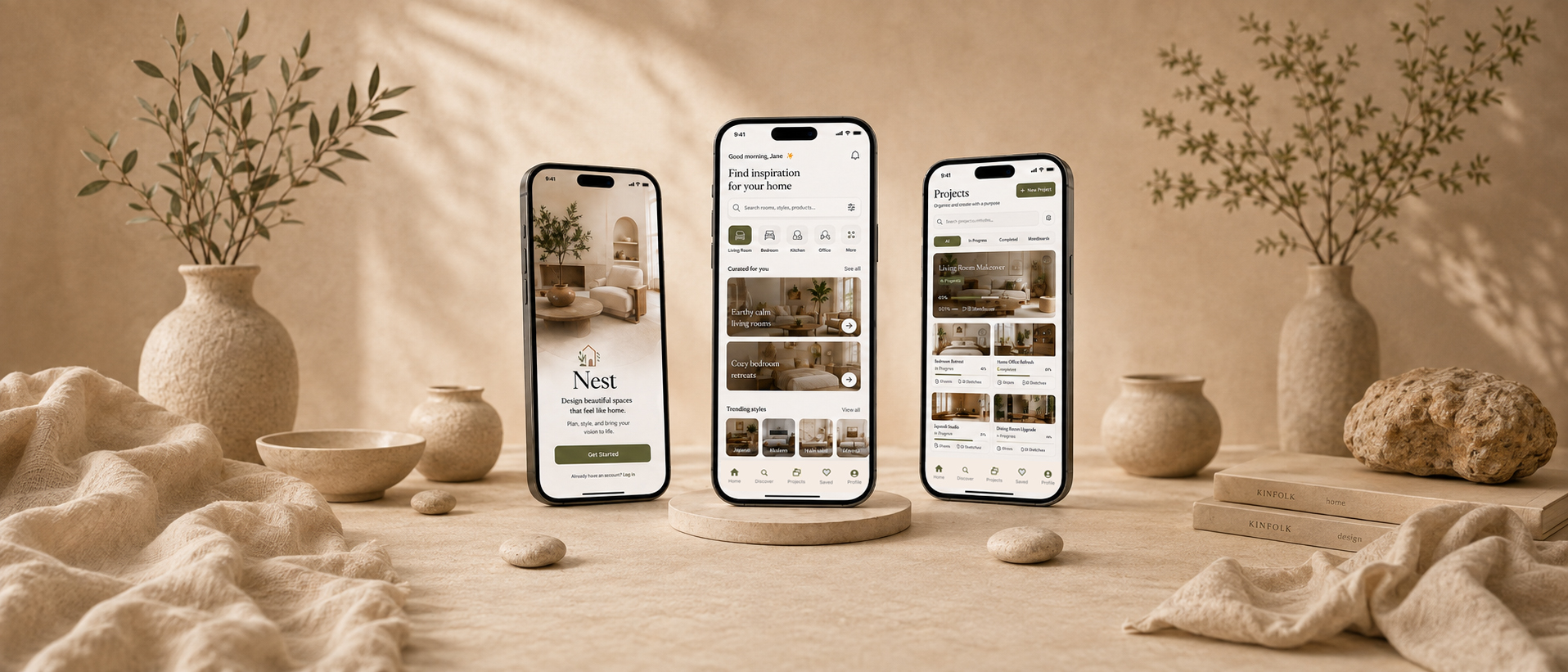
Turning scattered home inspiration into a calm, intuitive workspace for planning, organizing, and bringing interior design projects to life.
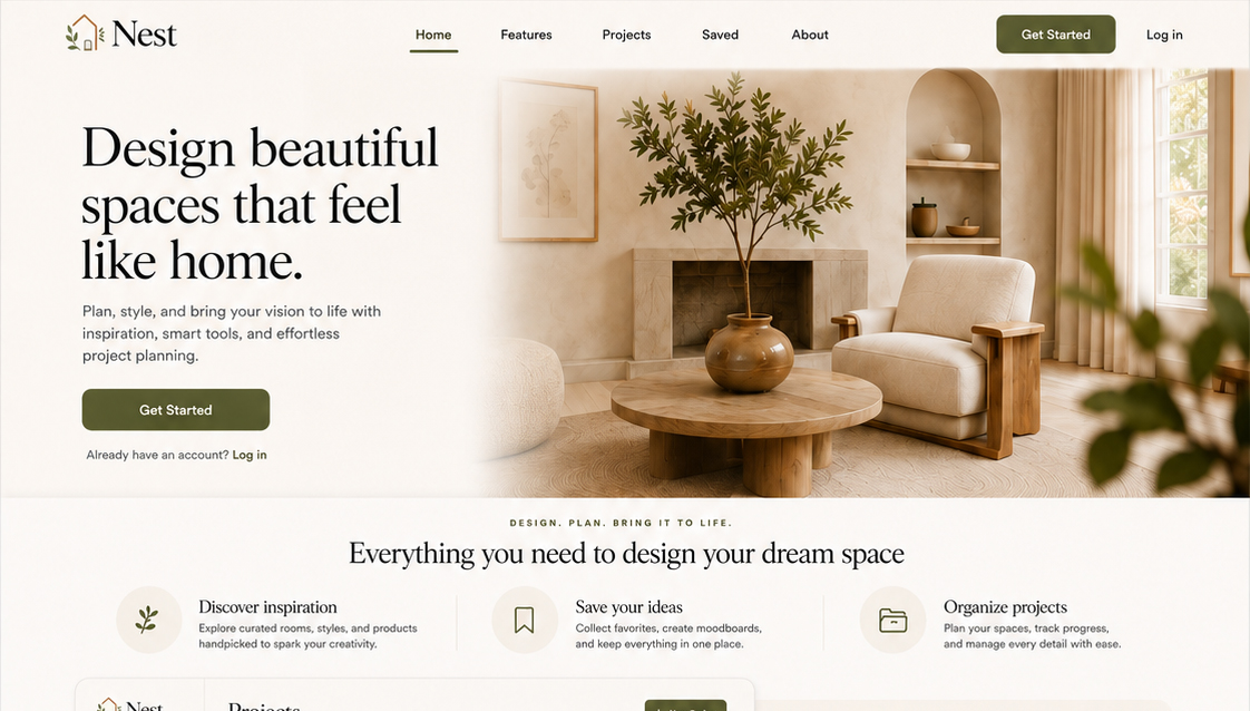
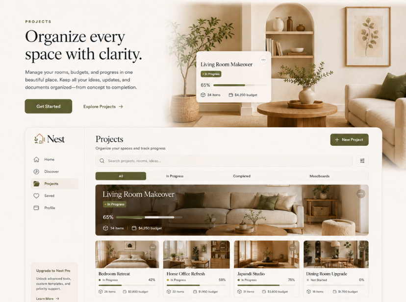
Nest brings home inspiration, organization, and project planning together in one intuitive experience. Users can discover interior ideas, save inspiration, create projects, organize spaces, and track their progress without moving between multiple places.
Planning a home project often means juggling inspiration, notes, and saved ideas across different places. Nest brings everything together in one clear journey from inspiration to execution.
10 sessions with renters and homeowners to understand how they collect inspiration, plan rooms, and make decisions during home projects.
Reviewed saved images, notes, shopping lists, and project boards to identify where ideas lose context and become difficult to organize.
Evaluated 6 home inspiration and planning apps based on organization, project clarity, saving flows, and ease of turning inspiration into action.

Excited, but unsure where to begin
Inspired and focused
Confident, in control
Reassured, organized, and ready to continue
Low-fidelity structure and flow, validated before visual design.


Users were unsure what to do next or how their project was progressing.
Users had difficulty understanding how saved ideas could be organized into specific rooms or projects.
Users found it harder to scan tasks, inspiration, and shopping items when everything appeared at once.
A simple step-by-step structure makes progress visible and helps users understand what to do next.
Saved ideas can be assigned directly to specific rooms and projects, keeping inspiration organized and contextual.
Tasks, saved items, and progress are grouped into clear sections so users can quickly understand the status of a project.
Reduced content density and clearer hierarchy make each screen easier to scan and navigate.
The shipped interface — high-fidelity, accessible, and system-driven.


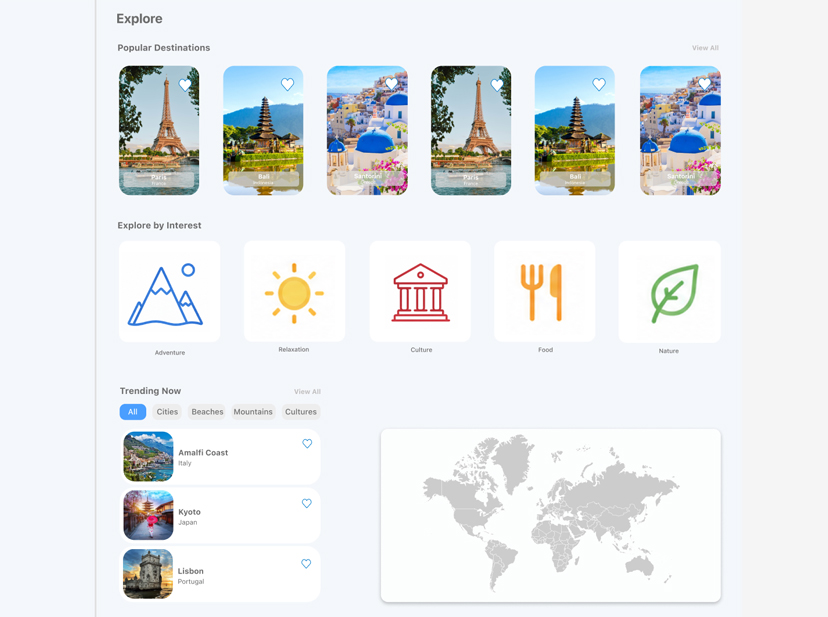
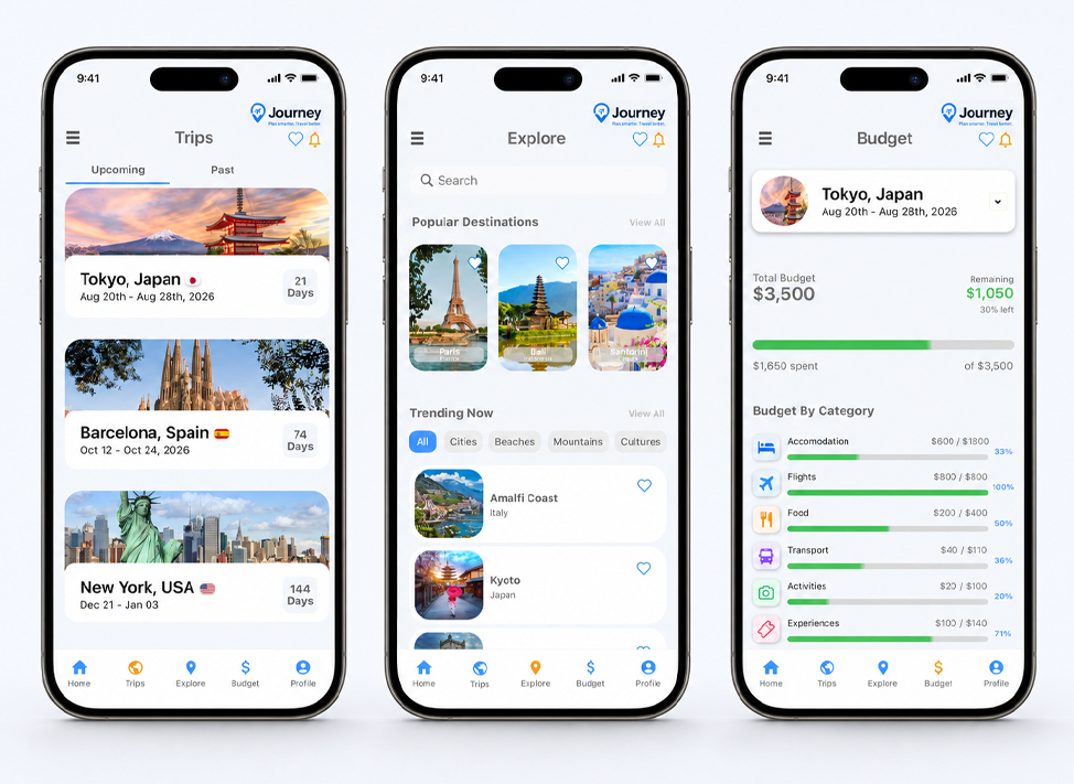
Creating a seamless travel planning experience that helps users discover destinations, organize trips, and manage every detail in one place.
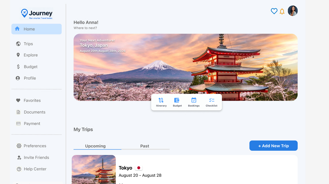
Creating a seamless travel planning experience that helps users discover destinations, organize trips, and manage every detail in one place.
Travel planning felt scattered across too many apps and websites — users struggled to keep destinations, bookings, budgets, and itineraries organized, making the process stressful and difficult to manage.
12 travelers shared how they currently plan trips, revealing frustration with switching between multiple apps, notes, and booking platforms.
Reviewed leading travel and itinerary apps to identify common patterns, missing features, and opportunities to simplify the planning experience.
Tested early Journey flows with users to understand how easily they could discover destinations, organize itineraries, and keep trip details in one place.

Inspired and curious
Focused and in control
Confident and prepared
Relaxed and ready
Low-fidelity structure and flow, validated before visual design.


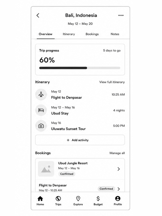
Users had to jump between multiple apps, notes, and booking sites, making it difficult to understand the full trip at a glance.
Users struggled to tell which parts of the trip were confirmed, still being planned, or needed attention.
Destinations and activities were easy to save, but users found it difficult to connect them to a specific trip or day.
Brought itinerary, bookings, budget, and saved ideas into one connected experience so users can manage the whole trip in one place.
Added simple status labels and progress indicators to show what is confirmed, upcoming, or still needs action.
Saved destinations and activities can be assigned directly to trips and itinerary days, making inspiration easier to use.
A clear trip overview brings together plans, bookings, and key details so users no longer need to search across different sections.
The shipped interface — high-fidelity, accessible, and system-driven.
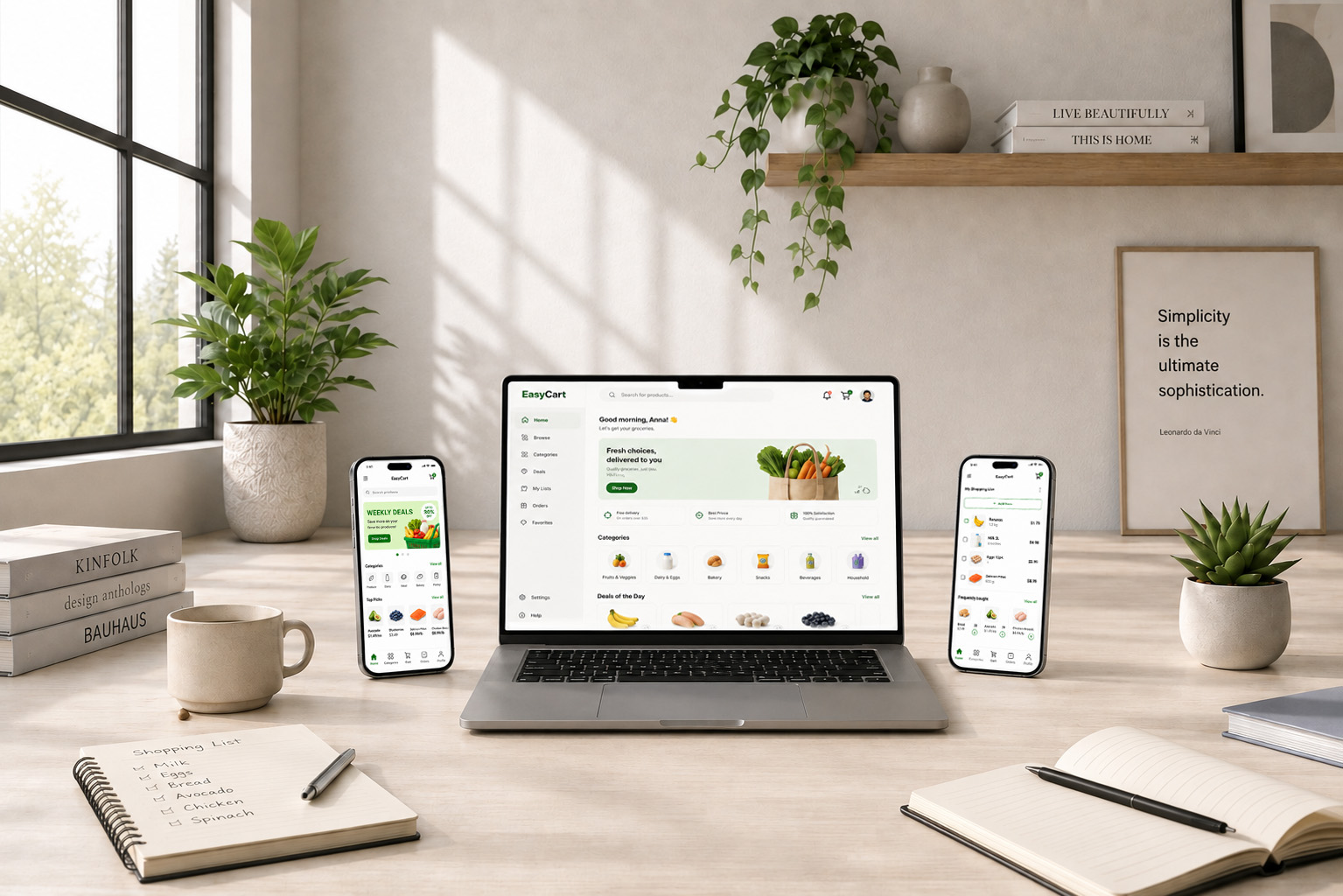
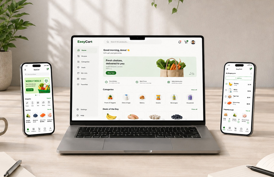
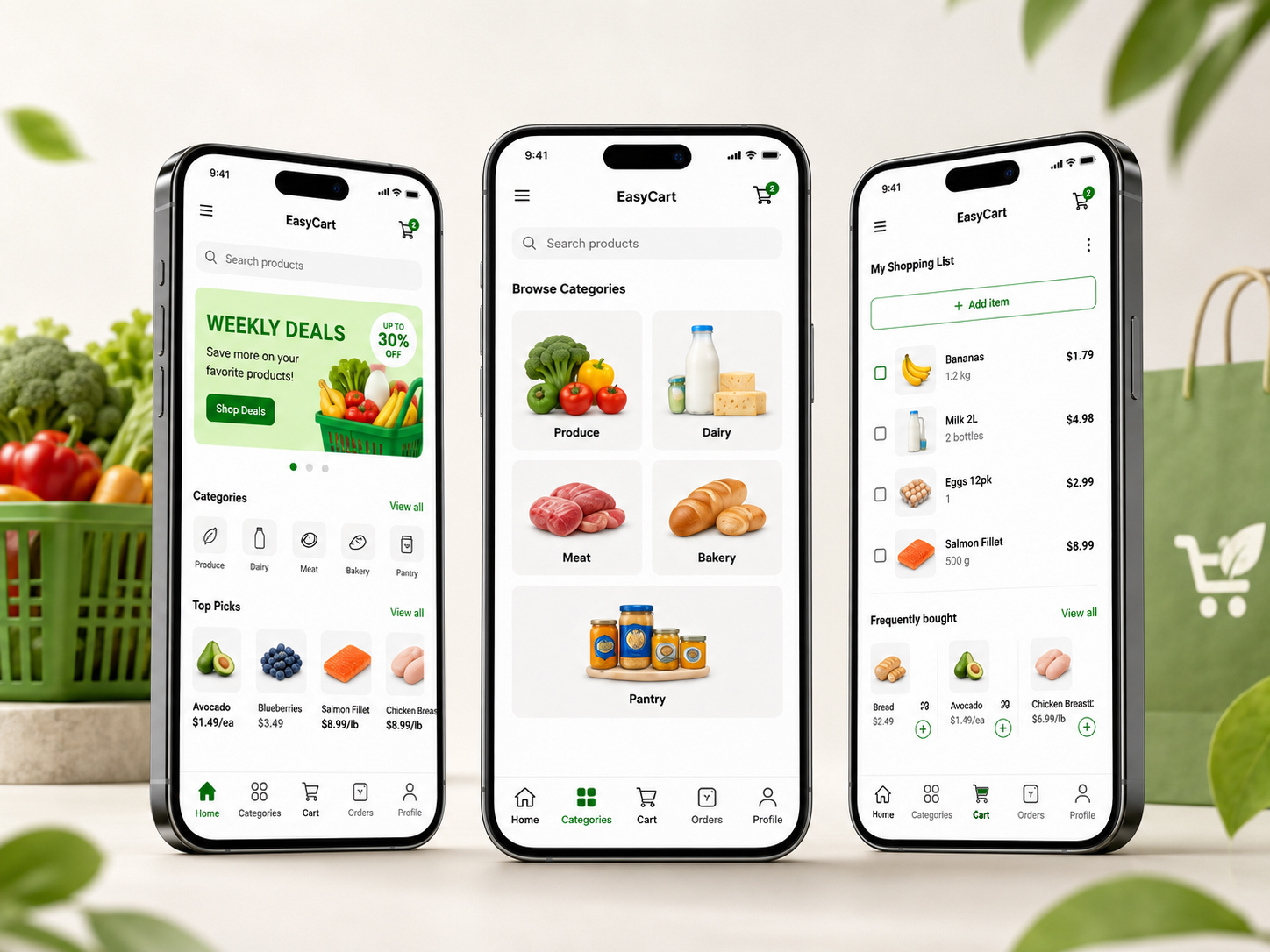
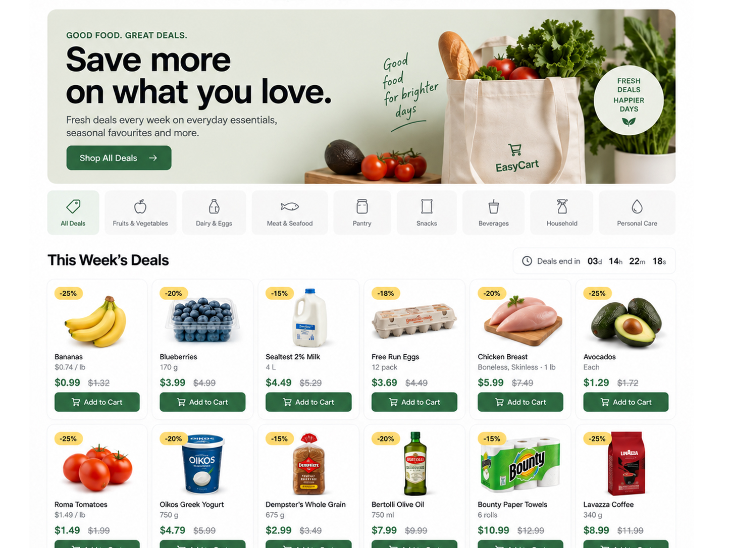
Simplifying everyday grocery shopping by bringing product discovery, shopping lists, and purchasing decisions into one clear, intuitive experience.
Easy Cart helps busy shoppers plan, find, and buy everyday essentials with less friction. The experience brings product discovery, shopping lists, cart management, and checkout into one simple flow designed to make grocery shopping faster and easier
Online grocery shopping often felt cluttered and repetitive. Users struggled to find products quickly, manage recurring purchases, and keep track of what they actually needed. Too many steps between browsing and checkout made a simple shopping task feel unnecessarily complicated.
16 participants shared how they plan and complete everyday shopping, revealing common pain points around finding products, remembering essentials, and managing repeat purchases.
Tested product discovery, cart management, and checkout flows to understand where users hesitated, abandoned tasks, or needed clearer feedback.
Reviewed leading grocery and shopping apps to identify familiar patterns, unnecessary friction, and opportunities to make Easy Cart faster and simpler.

Focused, looking for speed
Confident, efficient
Organized, in control
Relieved, satisfied
Low-fidelity structure and flow, validated before visual design.
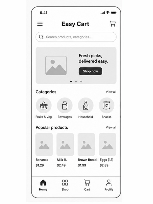

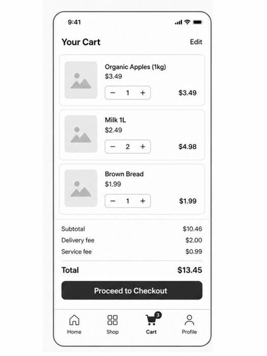
Users felt there were too many steps between reviewing their cart and completing a purchase, increasing the chance of abandonment.
Users struggled to quickly find frequently purchased items and had to repeat the same searches across shopping sessions.
Quantity, pricing, and delivery details were not always clear enough at a glance, slowing down final review before checkout.
Reduced unnecessary steps and kept the checkout flow focused, helping users move from cart review to purchase with less friction.
Added clearer search, categories, and easier access to frequently purchased items so users can find what they need faster.
Improved quantity controls, pricing, and delivery information so users can understand their cart at a glance.
Used clear labels, recognizable patterns, and straightforward actions throughout the experience to make shopping feel effortless.
The shipped interface — high-fidelity, accessible, and system-driven.

Connecting dancers through a simple, engaging experience for discovering compatible partners, matching by style and skill, and turning shared interests into real-world connections.
Dance Match helps dancers find compatible partners based on style, level, location, and availability, making it easier to connect and plan a practice or social.
Finding the right dance partner can be slow and frustrating. Dancers often rely on social media, group chats, or chance encounters, with little information about compatibility before reaching out.
Spoke with dancers about how they currently find partners, what makes a good match, and where the process breaks down.
Looked at dating, community, and dance platforms to understand common matching patterns and identify gaps.
Tested early flows to see how quickly users could find a suitable partner and what information they needed before reaching out.

Curious, hopeful
Focused, selective
Interested, slightly cautious
Confident, excited
Low-fidelity structure and flow, validated before visual design.

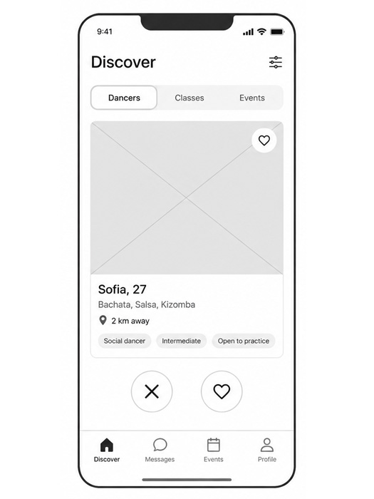

Users needed to see dance style, skill level, and availability before deciding to connect.
The matching flow felt longer than expected and made it harder to start a conversation quickly.
Some users overlooked the filter options when trying to narrow down potential partners.
Made dance style, level, location, and availability visible at a glance.
Reduced the number of steps needed to find and contact a potential partner.
Moved filters into a more visible position and simplified the options.
Added clear match states and prompts so users always know what to do next.
The shipped interface — high-fidelity, accessible, and system-driven.